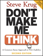
Book Review: Don’t Make Me Think
Filed Under Book Reviews

I originally read Steve Krug’s classic on a 4 hour flight to Chicago, and ever since has been sitting on my bookshelf begging for a review. And trust me, if there is any book that deserves to be put on a pedestal – it is Don’t Make Me Think.
Many years ago when I read the first edition of this book, I remember absorbing every “forehead smacking” point as I turned each and every page. However, probably the largest reason for falling in love with this book is because the author took the time to apply his knowledge to the book which resulted in a “fun to use” book. Each page was not about dry information, but instead had great design, layout, and perfectly written to support the points which Krug was trying to make. In a sense, he “ate is own dogfood”
This book is not provide blue prints for good design, nor does it dive deep into technology (although it does mention CSS). The reason I love this book is because it gets to the core of usability: how users read pages, why they get frustrated, and things to avoid confusion. Good design is subjective, but usability starts to become objective when you realize how predictable people are!
Chapter List
- Don’t make me think!
- How we really use the Web
- Billboard Design 101
- Animal, vegetable, or mineral?
- Omit
needlesswords - Street signs and Breadcrumbs
- The first step in recovery is admitting that the Home page is beyond your control
- “The Farmer and the Cowman Should Be Friends”
- Usability testing on 10 cents a day
- Usability as common courtesy
- Accessibility, Cascading Style Sheets, and you
- Help! My boss wants me to ______.
The Good
- Written so the concepts are easy to digest
- Very fast read
- Straight to the point
- Funny (hilarious at times)
- Beautifully laid out with supporting illustrations in all the correct places
The Bad
- The focus of the usability studies all were web oriented, and I believe that most points where generic enough to be equally applied to desktop applications. As a result, I would have liked to see one more chapter giving attention to other mediums than the web.
- Not a big fan of the old fashioned two-way mirror and video recording usability tests, so a small portion of Chapter 9 was a miss in my opinion. As I have indicated before, there are easier ways to get client feedback.
This book is an absolute must read for developers and stakeholders alike. Books such as About Face and The Design of Everyday Things will not give you the same information in such a fun and distilled manner. Regardless if this book is your first or tenth book you have read on design…make it your next.
 Don’t Make Me Think: A Common Sense Approach to Web Usability
Notice: All reviews on codesqueeze are not paid nor are traded for services. These reviews are shared so you may save time in your quest for better tools.
3 Responses to “Book Review: Don’t Make Me Think”


[…] Book Review: Don’t Make Me Think (Max Pool) […]
I’ve read this twice and it’s an awesome book. If you’re a web developer, I’d say this is a must read. In fact, I made everyone that I work with read it so that we can all be on the same page. It’s very effective for developers and non-developers alike.
I’ve read this book a few times, and often pick it up to get an occasional dose of inspiration to keep me thinking about my users.
You said:
“The focus of the usability studies all were web oriented, and I believe that most points where generic enough to be equally applied to desktop applications. As a result, I would have liked to see one more chapter giving attention to other mediums than the web.”
While I agree that he focuses on web development, I find it pretty easy to substitute in the word “API” almost everywhere, and all of a sudden this book becomes a great book about API design as well.
Rock on.