How To Write Validators That Demand Attention
Filed Under CodeASP.NET validators are bad at getting attention. Period.
Users do not want to view validation summaries at the top of a page, only to go visually searching through your form for the invalid fields. Nor do they want to play a rousing game of hide-and-go-seek with little red asterisks (*). This is especially true when your form becomes larger and/or when multiple validation errors occur. The form below is fairly common place:
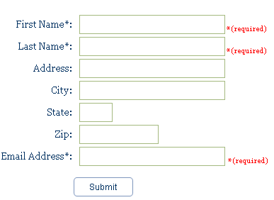
By writing your own custom validators, you can override the EvaluateIsValid and Render methods to add a new dimension of usability. Here are 3 tricks that you can implement in your own custom validators:
1. Modify Control.BackColor
Changing the BackColor property of the invalid control can be a quick and easy way to allow the user to instantly view which fields are invalid. Additionally, this is a way to do validation in situations where screen real estate is limited (i.e. PDA).
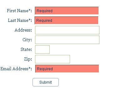
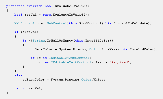
The implementation of this is easy: override the EvaluateIsValid method of the validator you are inheriting from (in this case the RequiredFieldValidator), find the control being validated, and set its BackColor property. Control of the color has been accomplished by an added property called InvalidColor and text is added to the control if it is of type IEditableTextControl.
Note: Modification of the invalid control must occur earlier in the ASP.NET Page Life Cycle than the Render method as it may be too late and rendering of the invalid control may have occured.
2. Use Animation
Using an image as a validation marker is generally a bad idea; however, in some circumstances images can work. Compact forms or very clean designs may benefit from a more stream-lined form of pinpointing invalid data. Before using images be sure that the users are able to fully understand what the iconic representation of each image is.
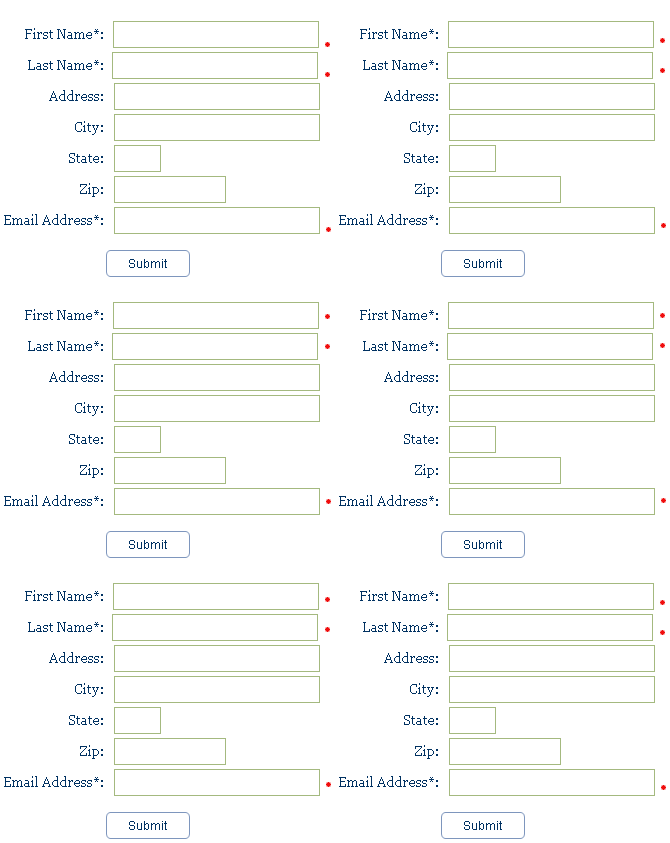
Implementation of this type of custom validator is slightly different as you will need to override the Render method. This is because dynamic creation and rendering of an Image control needs to occur before the base rendering.

3. Be Blatant
When all else fails, throwing messages the size of billboards will always work. To accomplish this, I used some Bubble Tooltip CSS, and put together a validator that displayed absolutely positioned balloon messages.
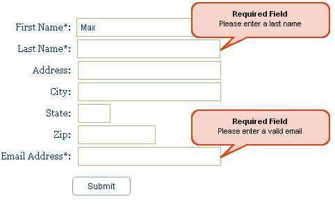
Using the two concepts outlined above, writing this validator is can be done is 3 small steps. First, we need to create the balloon image.

Second, register the CSS in the EvaluateIsValid method.
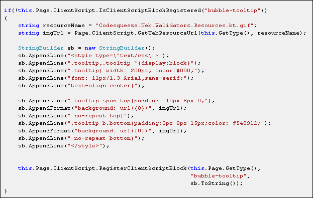
Finally, insert the specific HTML in during the Render method.

In order to achieve the absolute positioning you will have to create a style tag on your validator such as the one below.

UPDATE: Check out the ValidatorCallout in the ASP.NET AJAX Control Toolkit. Everything as the above with none of the work!
Feel free to download these validators and modify them for happier validating!
One Response to “How To Write Validators That Demand Attention”


Hmmm, thnx great ideas for making my own !